Before we go into solving the questions from the NCERT book Exercise 4.1 Data Handling, let’s look at some of the main points you need to keep in mind. Just go through it once, even if you are thorough with the chapter –
- Pie Charts: Visual representation of data in a circular chart.
- Central Angle Formula: (Number of items / Total number of items) × 360 degrees.
- Steps to Draw a Pie Chart:
- Calculate total number of items.
- Determine the fraction of the circle each item represents.
- Multiply the fraction 360 degrees to get the central angle.
- Draw sectors using the calculated angles.
Example 1: If a pie chart represents 40 students choosing subjects, and 10 choose Math.
Total students = 40.
Fraction choosing Math = 10/40 = 1/4.
Central angle for Math = (1/4) × 360 = 90 degrees.
Example 2: In a pie chart showing favorite fruits among 50 people, 20 people prefer apples.
Total people = 50.
Fraction preferring apples = 20/50 = 2/5.
Central angle for apples = (2/5) × 360 = 144 degrees.
NCERT Solutions for Class 8 Maths Exercise 4.1 Chapter 4 Data Handling
1. A survey was made to find the type of music a certain group of young people liked in a city. The adjoining pie chart shows the findings of this survey. From this pie chart, answer the following:
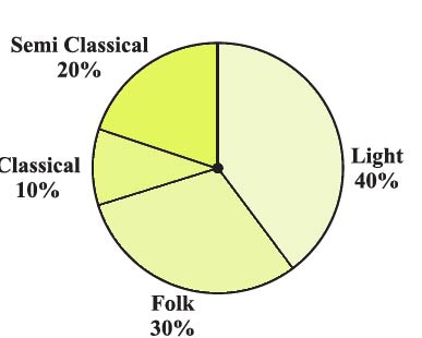
(i) If 20 people liked classical music, how many young people were surveyed?
Classical music accounts for 10% of the pie chart.
If 20 people represent 10%, then the total number of people surveyed is calculated by:
(20 people / 10%) × 100%
= 200 people.
So, 200 young people were surveyed.
(ii) Which type of music is liked by the maximum number of people?
According to the pie chart, Light music is liked by the maximum number of people.
So most people like light music, accounting for 40% of the preferences.
(iii) If a cassette company were to make 1000 CDs, how many of each type would they make?
They would make CDs in proportion to the percentages shown in the pie chart:
Classical:
10% of 1000 CDs = 0.10 × 1000
= 100 CDs for Classical.
Semi Classical:
20% of 1000 CDs = 0.20 × 1000
= 200 CDs for Semi Classical.
Folk:
30% of 1000 CDs = 0.30 × 1000
= 300 CDs for Folk.
Light:
40% of 1000 CDs = 0.40 × 1000
= 400 CDs for Light.
2. A group of 360 people were asked to vote for their favourite season from the three seasons rainy, winter, and summer.
| Season | No. of votes |
|---|---|
| Summer | 90 |
| Rainy | 120 |
| Winter | 150 |
(i) Which season got the most votes?
According to the table, Winter got the most votes, with 150 votes.
(ii) Find the central angle of each sector.
The central angle of each sector in a pie chart is proportional to the number of votes each season received. Since there are 360 degrees in a circle, the central angle can be calculated by:
(Central angle) = (Number of votes for the season / Total number of votes) × 360°
For Summer: (90 / 360) × 360° = 90°
For Rainy: (120 / 360) × 360° = 120°
For Winter: (150 / 360) × 360° = 150°
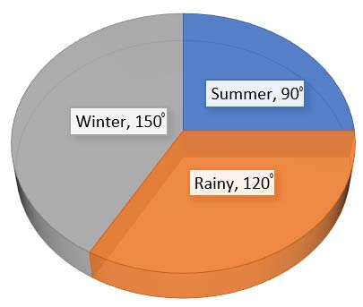
(iii) Draw a pie chart to show this information.
To draw a pie chart, we would use the central angles calculated for each season to create the sectors.
Summer will have a 90° sector, Rainy will have a 120° sector, and Winter will have a 150° sector.
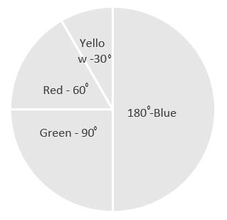
3. Draw a pie chart showing the following information. The table shows the colours preferred by a group of people.
| Colours | Number of people |
|---|---|
| Blue | 18 |
| Green | 9 |
| Red | 6 |
| Yellow | 3 |
| Total | 36 |
To draw a pie chart from the given data, follow these steps:
1. Calculate the total number of people surveyed. According to the table, this is 36 people.
2. Determine the fraction of the circle each color represents by dividing the number of people who prefer each color by the total number of people.
3. Multiply these fractions by 360° to get the central angle for each color’s sector in the pie chart.
For Blue:
Number of people who prefer Blue / Total number of people × 360°
(18 people / 36 total) × 360° = 0.5 × 360° = 180°
For Green:
Number of people who prefer Green / Total number of people × 360°
(9 people / 36 total) × 360° = 0.25 × 360° = 90°
For Red:
Number of people who prefer Red / Total number of people × 360°
(6 people / 36 total) × 360° = 1/6 × 360° = 60°
For Yellow:
Number of people who prefer Yellow / Total number of people × 360°
(3 people / 36 total) × 360° = 1/12 × 360° = 30°
These angles are then used to draw sectors in the pie chart, each representing the color preference of the group.
4. The adjoining pie chart gives the marks scored in an examination by a student in Hindi, English, Mathematics, Social Science and Science. If the total marks obtained by the students were 540, answer the following questions.
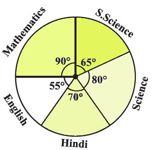
(i) In which subject did the student score 105 marks?
(Hint: for 540 marks, the central angle = 360°. So, for 105 marks, what is the central angle?)
First, calculate the value of 1 mark in terms of the central angle:
Central angle for 540 marks = 360°
So, central angle for 1 mark = 360° / 540 = 2/3°
Next, calculate the central angle for 105 marks:
Central angle for 105 marks = 105 × (2/3)° = 70°
According to the pie chart, the central angle of 70° corresponds to the subject of Hindi.
(ii) How many more marks were obtained by the student in Mathematics than in Hindi?
Student Marks in Mathematics = Fraction part × Total marks
90°/360° × 540 = 135
We know that marks obtained in hindi = 105
Difference between marks obtained in Mathematics and Hindi = 135 – 105 = 30
Therefore, the student scored 30 more marks in Mathematics than in Hindi.
(iii) Examine whether the sum of the marks obtained in Social Science and Mathematics is more than that in Science and Hindi.
(Hint: Just study the central angles).
First, we calculate the marks obtained in Social Science:
Central angle for Social Science = 65°.
The formula to calculate the marks is (central angle / 360) × total marks.
Marks in Social Science = (65° / 360°) × 540 = 97.5 marks.
Next, we calculate the marks obtained in Science:
Central angle for Science = 80°.
Marks in Science = (80° / 360°) × 540 = 120 marks.
Now, we already know from the previous information that:
Marks in Mathematics = 135 marks.
Marks in Hindi = 105 marks.
We sum the marks obtained in Social Science and Mathematics:
97.5 (Social Science) + 135 (Mathematics) = 232.5 marks.
Then, we sum the marks obtained in Science and Hindi:
120 (Science) + 105 (Hindi) = 225 marks.
Comparing the sums, 232.5 marks (Social Science and Mathematics) is greater than 225 marks (Science and Hindi).
Thus, the student scored more marks in the combination of Social Science and Mathematics than in Science and Hindi.
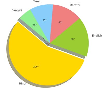
5. The number of students in a hostel, speaking different languages is given below. Display the data in a pie chart.
| Language | Hindi | English | Marathi | Tamil | Bengali | Total |
|---|---|---|---|---|---|---|
| Number of students | 40 | 12 | 9 | 7 | 4 | 72 |
To create a pie chart, we calculate the central angle for each sector representing a language. Here are the steps and calculations:
For Hindi:
Number of students = 40.
Central angle = (40 / 72) × 360° = 200°.
For English:
Number of students = 12.
Central angle = (12 / 72) × 360° = 60°.
For Marathi:
Number of students = 9.
Central angle = (9 / 72) × 360° = 45°.
For Tamil:
Number of students = 7.
Central angle = (7 / 72) × 360° = 35°.
For Bengali:
Number of students = 4.
Central angle = (4 / 72) × 360° = 20°.
Each language’s central angle corresponds to the proportion of students speaking that language. With these angles, we can draw sectors in a pie chart to visually represent the data.
